
5 ways to easily improve web accessibility
What is web accessibility and why is it important? When you have a website, you want to attract as many visitors as possible. By making your website accessible you are ensuring that is usable for a wider range of people, including those with disabilities and impairments. This gives them the ability to navigate, interact, and understand the website and overall have a good user experience too. Not only that, but web accessibility can also positively impact SEO as most of the requirements including alt text and user experience can be seen as contributing towards ranking factors. You are probably wondering; how do I make my website accessible? Let’s look at few easy ways to improve your website accessibility.
1. Alternative (ALT) text in images
Alt text is short for alternative text. Also known as alt attributes or alt descriptions (sometimes mistakenly referred to as alt tags). They are short sections of text that describe the images within the HTML code. Often, they can be overlooked but they are important for web accessibility because they are read aloud to the visually impaired visitors using screen readers. This gives them a better understanding of what the image is showing. Adding alt text allows authors to include images, but still provide the content in an alternative text-based format. If there is no alt text, the screen reader will read the file name, see example below.
Alt tags are recommended to be concise, about 125 characters, and it’s worth bearing in mind that if the image doesn’t load on the page, then the alt text will show.
How to provide a useful alt text?
It’s important to provide an accurate and concise description that is useful in the context of the document. You don’t need to include every little detail but is important that images that contain critical information are spelled out in the alt text.
A good way of thinking about it, is to include what you may describe to someone else over the phone.
For example, a banner with an offer on the homepage.

If you only write “a lady holding shopping bags”, while it is a description, is not useful in the context of the banner, since the point of the banner is the offer. A better alt text would be “70% off handbags – lady with sunglasses holding shopping bags”.
Let’s look at another example:

<img src=”indoorplant.jpg” alt=”plant”>
This alt text is not very descriptive as there is more to the image.
<img src=” indoorplant.jpg” alt=” Indoor snake plant in a white plant pot placed on a wooden stool”>
This alt text is better as it’s more descriptive, while remaining concise.
Not recommended:
<img src=”indoorplant.jpg” alt=” plant pot plant white plant pot indoor plant snake plant indoor snake plant “>
This is not recommended as this is seen as keyword stuffing in alt text and wouldn’t read well if using a screen reader.
2. Choosing the right colours for web accessibility
Colour blindness is an umbrella term, there are several types of colour blindness, and each has a different degree of severity that can affect how the person sees the world. When choosing colours for something that has text (like a logo, buttons, banner) is important to think about contrast.
People with colour blindness will find it hard to read text that is not dark enough against a light background or light enough against a dark background. There can be information that gets lost, or it can cause the potential customer to leave the website, since it’s not easy to use.
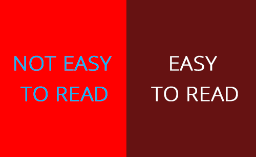
This is an example of what bad contrast vs good contrast looks like. As you can see, the blue text on the bright read is not only difficult to see for a disabled person, but also almost painful to look at for anyone. In contrast, the dark red with white text is very easy to read for anyone.
If you want to make sure the colours you are using have a good contrast for web accessibility, you can try this website contras-ratio.com – simply write the colour codes in the two boxes, one for ‘Background’ and one for ‘text colour’. The button in the middle will let you know if the combination has a good contrast or not.
3. Content structure for web accessibility

Structuring your content means using the correct heading tags. This will help the content to flow better and will be easier to understand. In addition, it helps screen readers to interpret your pages and it improves in-page navigation.
For example, the main heading on the page is usually a <h1> and there would normally only be one main heading on the page. Further subheadings would start with <h2> and any content ‘inside’ that h2 that requires another heading would use a <h3> and so on and so forth. This is an easy way to improve web accessibility and make a lot of visitors’ lives easier. For example:
<h1>Main Heading</h1>
<p>Paragraph of text.</p>
<h2>Subheading</h2>
<p>Another paragraph of text.</p>
<h3>Sub-Subheading</h3>
<p>Further paragraph of text.</p>
Find out more about HTML structure with w3schools
4. Avoid automatic media and navigation
Videos, or any sound, that automatically starts playing as soon as you land on a website can sometimes be disruptive to users in general. Especially if you are in a public and not expecting it, but turning it off can be difficult for people that use screen readers. Some screen readers need voice input to work, if the media is also playing, it might make the screen reader impossible to use. It would also take the user much longer to navigate to where the video is to stop it, causing a lot of frustration and negative feelings towards the website.
In addition to that, for people with disabilities autoplay can make the site unusable. If a person has cognitive disabilities, media that begins playing without their consent can find it confusing and/or distracting. If the media has a lot of flashing colours or strange noises, it may trigger seizures or other reactions.
5. Create content with web accessibility in mind
What does that mean? While it’s important to make sure all your colours have enough contrast and all your images have a descriptive alt text, it’s equally important that the written content is not confusing or overly complex. Always check for spelling mistakes or grammatical errors, spell out acronyms where useful to do so, and try to make sure all the information is plainly laid out and easy to read and understand.
In the end, you want people to feel comfortable and confident when they land on your website, and you want your content to be accessible to the widest range of users.